Section 1 - Concept
Section 1.1 - Prompt
For this project, we were prompted to plan, brand, and overall design the upcoming Transmedia Exhibition for 2023. In particular, as a game student, I wanted to find a way to gamify different elements of the exhibition as a whole in order to encourage interactivity before, during, and after the exhibit. In addition, we wanted to integrate gamification throughout everything we did, as a method of highlighting and celebrating the new Game Design/Development program and being the first game cohort in charge of Transmedia. As a group, we explored many elements we could integrate gaming into, between the overall theme, the website, etc. with much more freedom for what could be completed in time as the project would span over the entire year instead of just the semester. At first, we latched onto a retro gaming theme but many students felt that it being game centric was too much, so we instead decided on a "spreading colour" theme that could easily integrate gamification elements. In addition, we decided to have an optional, yet obvious, game within the website that would link to an in-person activity during the exhibition itself.
Section 1.2 - Delegation
For the overall exhibition, most design is being done by Eden Smithbury and Keira Geary with external input from myself and other students. While Keira focuses on branding, Eden and I have been working on the website and accompanying game, attempting to create an even medium allowing the website to be accessible without the game, while still integrating the game in a way that rewards visitors for playing it. We also went back and forth on ways to maintain the overall style we decided on while not making the game too easy or difficult and had numerous iterations and ideas. In addition, other students gave their game ideas and input, giving even more potentional designs within the overarching event.
Section 2 - Design
Section 2.1 - Picking a Theme
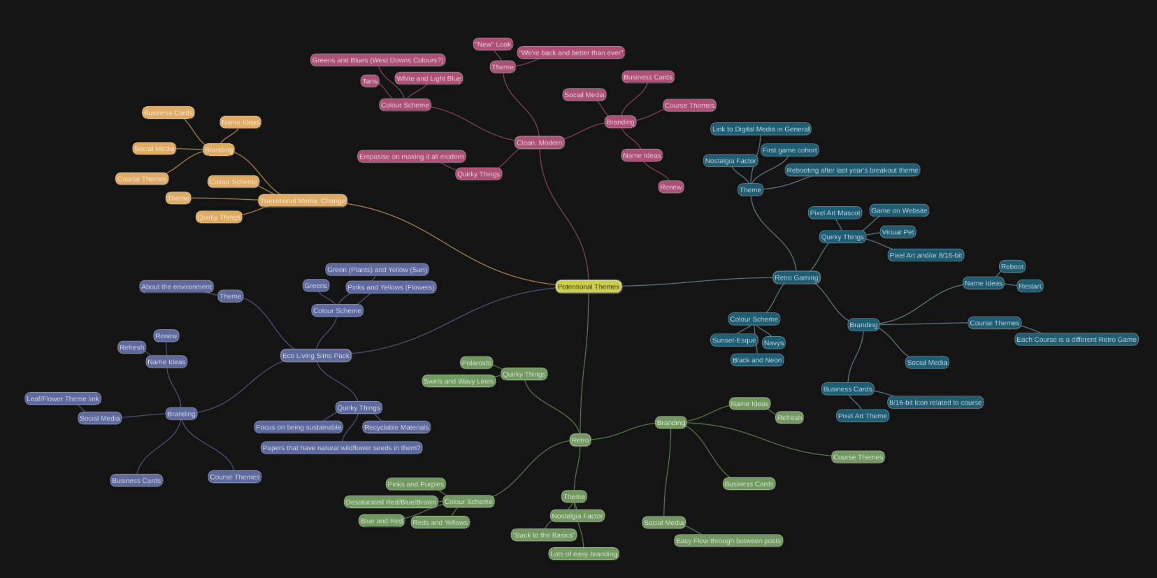
When we were first exploring themes, I created a mindmap to categorise each idea with its overarching theme and visualise where each theme was "lacking". While our final theme was not included on this mindmap, as we hadn't come up with the idea yet, we did utilise ideas from each of these separate themes that also worked.

Figure 2.1.1 - The theme mindmap showcasing 5 potentional themes.
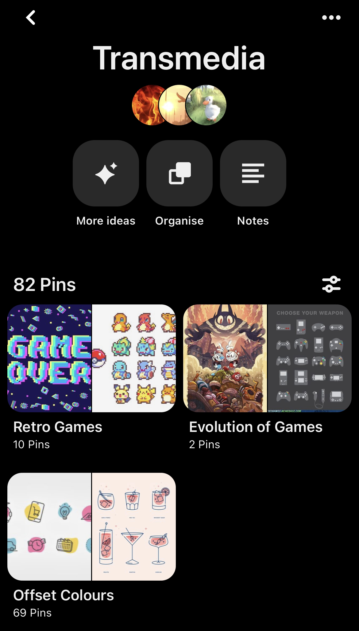
After that, I created a pinterest board for us to gather images representing each of the top three themes, which helped us narrow it down to two: retro games and spreading colour.

Figure 2.1.2 - Our transmedia pinterest board.
From there, since we couldn't decide amongst ourselves, we ran a poll of our classmates to see which theme they liked best.

Figure 2.1.3 - The results of polling the 2nd years.
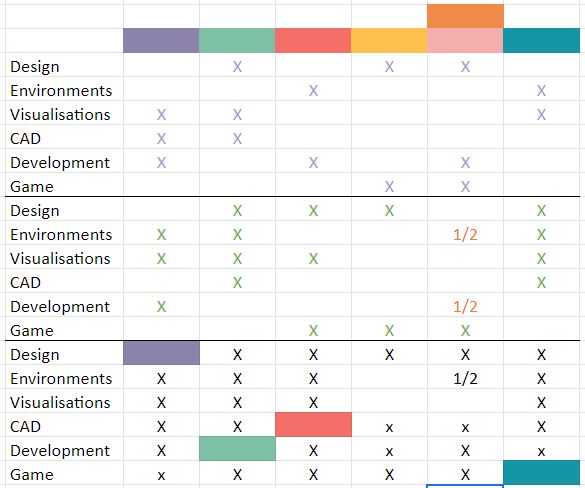
Since spreading colour won by a landslide, we moved forward with ideas related to that. However part of the theme was that each pathway would have its own colour associated with it and we struggled to come to an agreement, so we each listed our preferences and used process of elimination from there. Eden and I both had strong feelings about all of the pathways, but Keira's only strong feeling was that the game pathway wasn't green, which made it easier to compare everyone's preferences.

Figure 2.1.4. - On top is Eden's vetos, in the middle are my vetos, and on bottom is the combined charts with Keira's preference and the process of elimination.
After that, with the overall theme narrowed down, Keira could start work on the official branding material while Eden and I worked out the website design and development.
Section 2.2 - Website Ideas
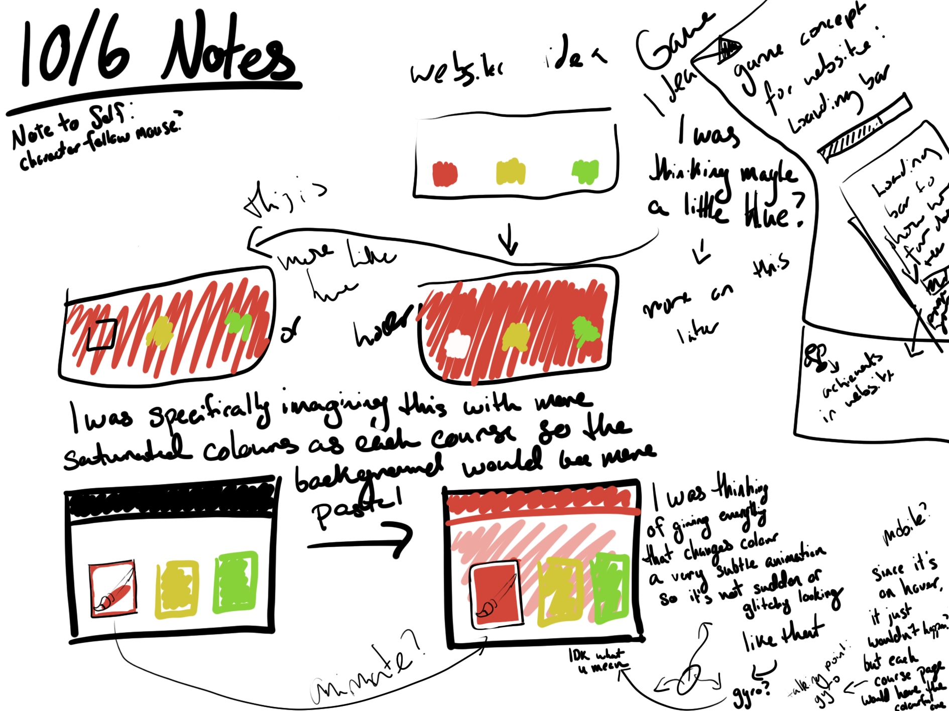
When brainstorming ideas for the website, we went through numerous iterations. The first thing we did is sketch out an idea where when the mouse hovered a specific pathway, the screen would "flood" with that colour, as seen in Figure 2.2.1.

Figure 2.2.1 - The original sketches and brainstorming for the website.
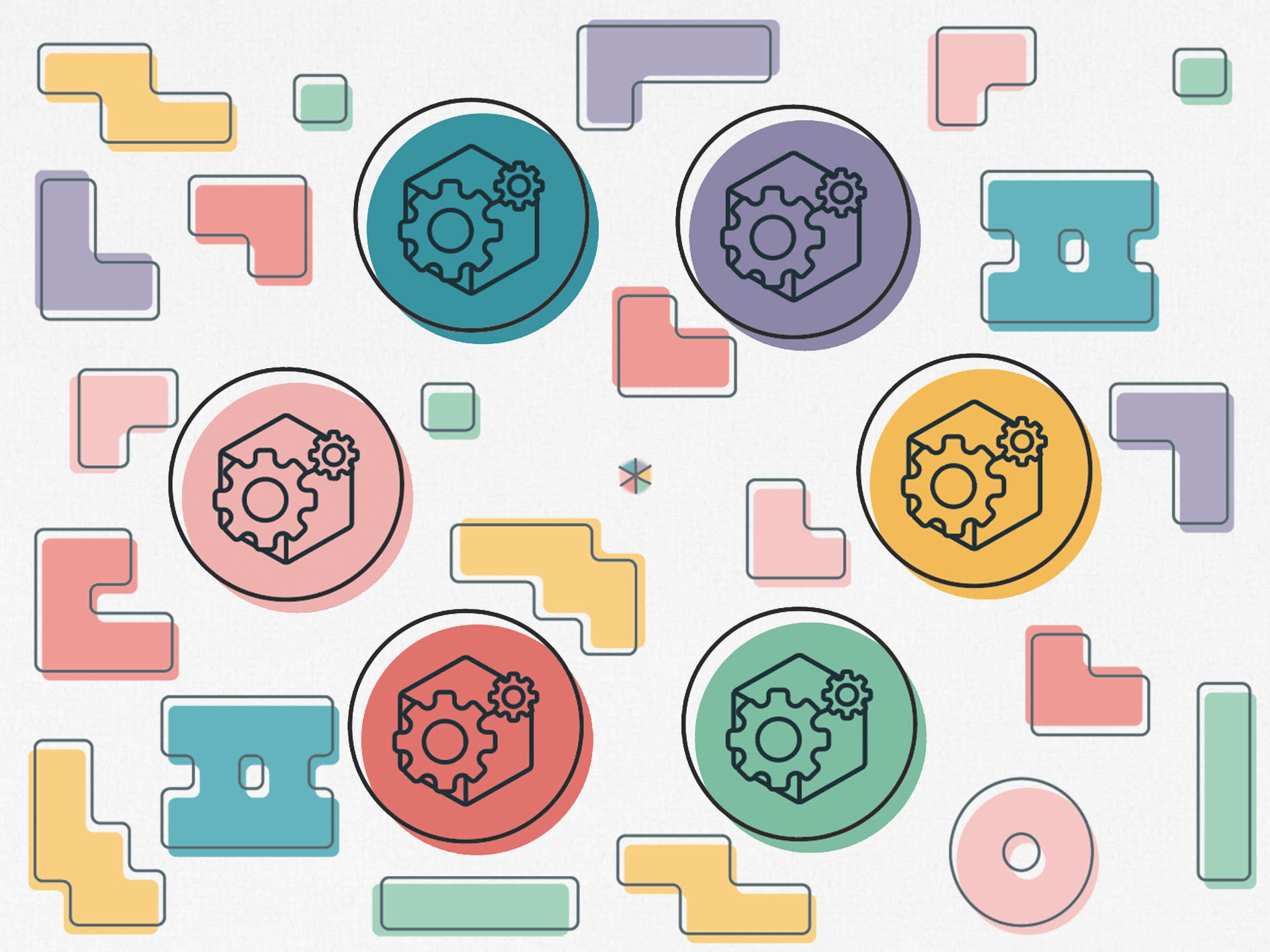
After that, I reworked the sketches to better fit with Eden's logo design and Keira's filler shapes. I had the idea of using background shapes as platforms for a player character to hop on. In order to add the theme of spreading color, I thought it best if the shapes started greyscale and gained color when you completed a level or objective within each pathway's page. After you completed all 6 levels, a bonus level would open up on the home page but now that all the platforms have gained color and therefore colliders, you have to find your way to the entrance to it as well.

Figure 2.2.2 - The next iteration of the website sketches.
However, there was concern that the background shapes, even in greyscale, would distract too much from the website as a whole or be overall too busy so I quickly threw togther a test image to see what the whole group thought (Figure 2.2.3).

Figure 2.2.3 - Testing to see if having shapes in the background was too much or not.
While this provided some clarity, it was still difficult to tell what it would properly look like as the test image had the logo directly over the background shapes where as the actual design would have them seperate to each other, so I created a more in-depth prototype to explore this idea.

Figure 2.2.4 - An image of the prototyped website.
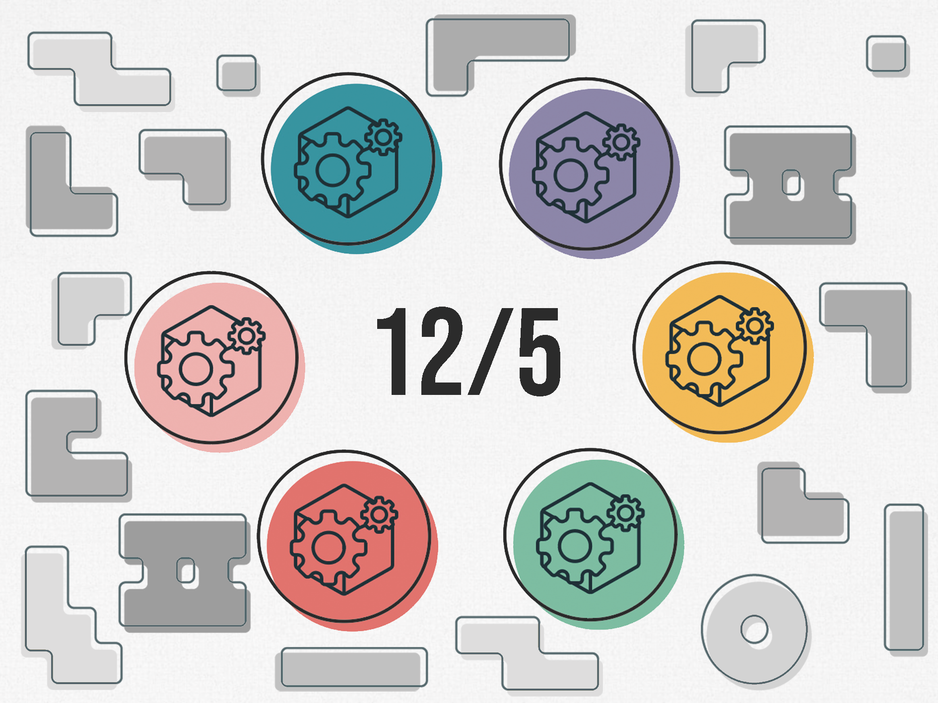
We also considered a variation of the idea that foregoes the center part all together and simply displays the date of the Transmedia Exhibition there, with the potentional that it would change to a little blurp about each pathway when they were hovered over.

Figure 2.2.5 - An alternate version of the previous design which would showcase the date of the Exhibition.
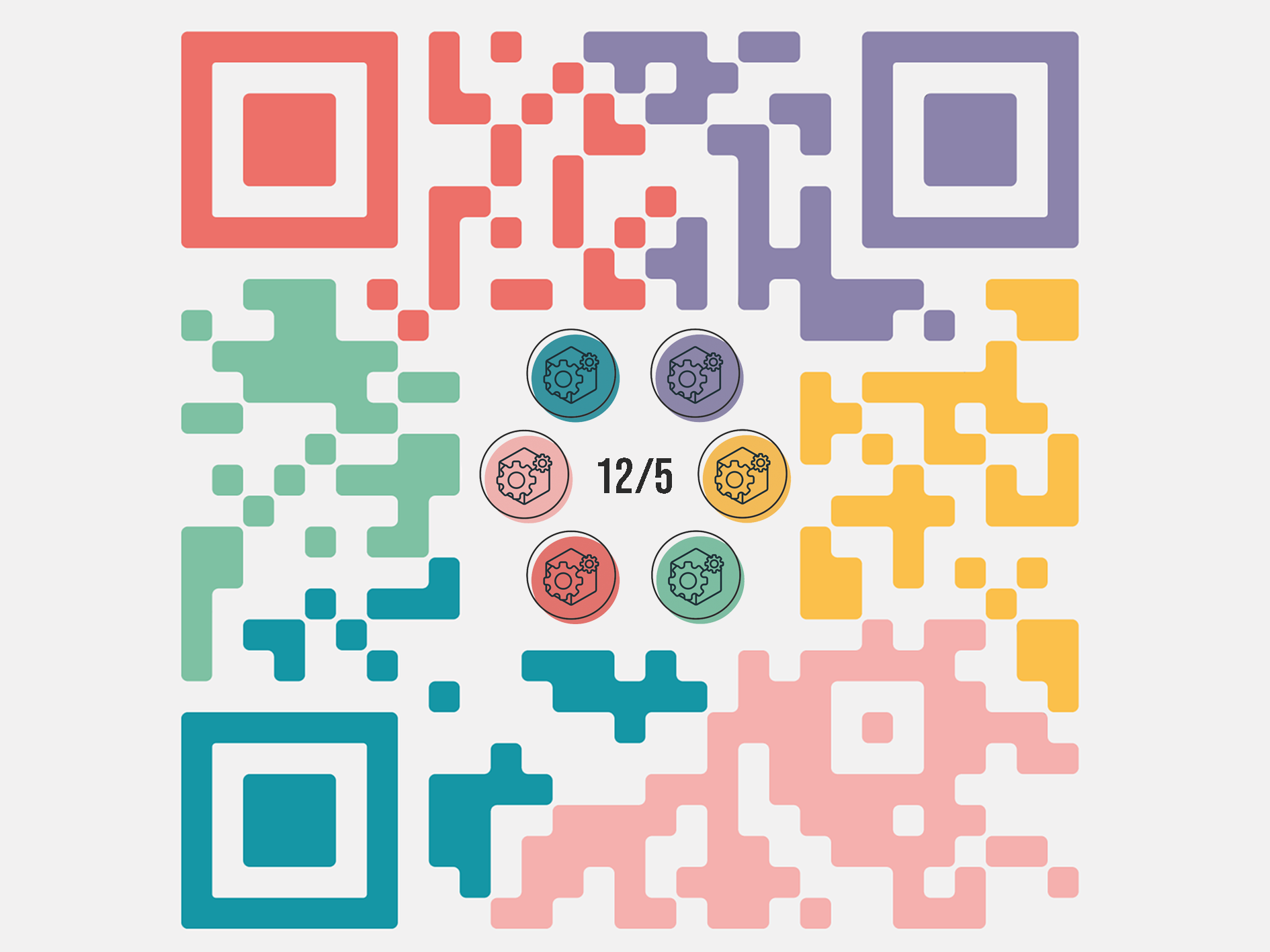
While we were brainstorming, a housemate of Eden and I obversed that the shapes looked distinctly like a QR code which prompted Eden to create a version of the logo within a colorful QR code. This gave us the idea of the website being a zoomed in QR code, and when you completed all of the levels, the home page would zoom out to show the QR code. From there, the QR code could take you to bonus levels either within the mobile version of the website or within a Transmedia App.

Figure 2.2.6 - Another version that integrates a QR code into the design.
Overall, while I prototyped multiple of these designs, I feel as though the last one is the most creative and interesting idea, as it combines multiple people's input and creates a fun secret to discover in the completion of the game.
Section 2.3 - Prototypes
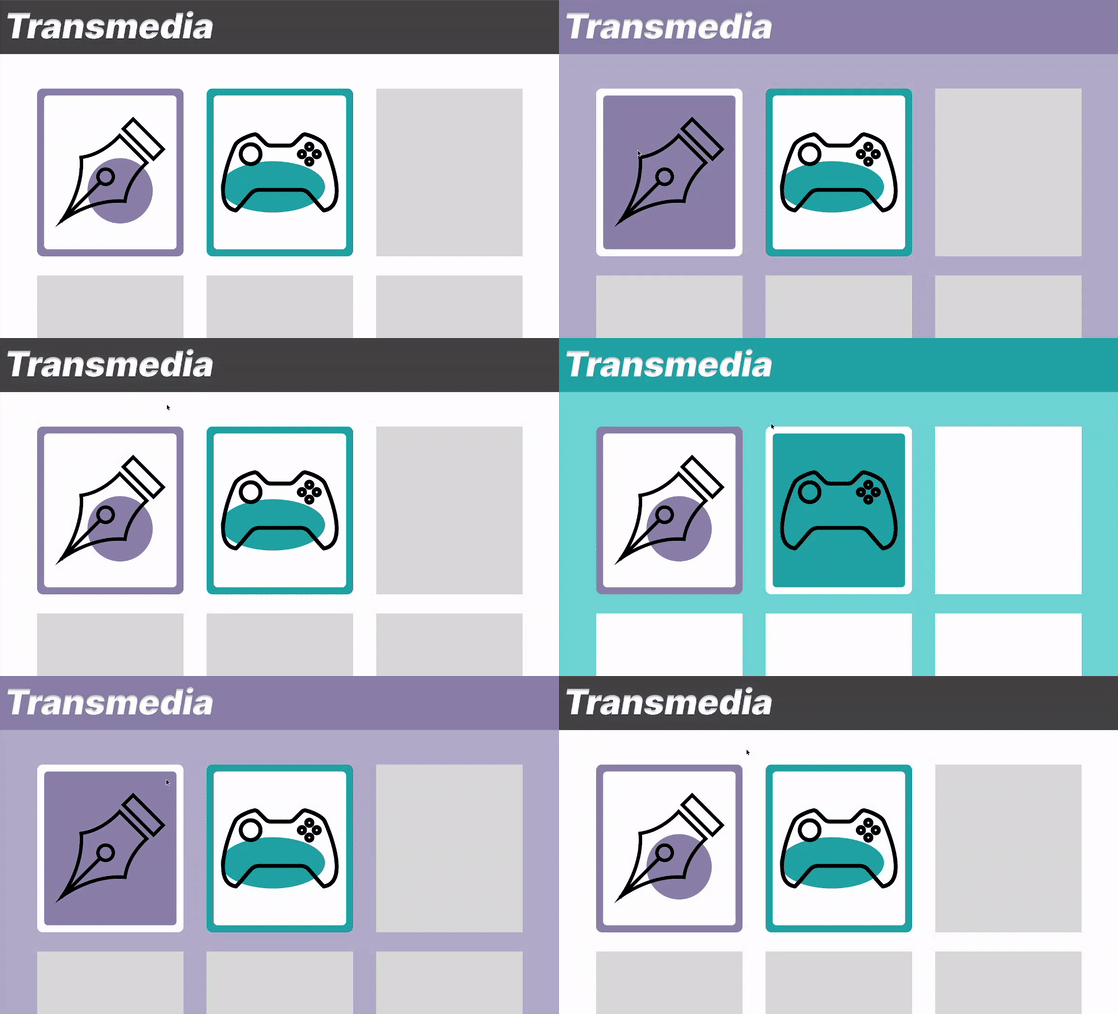
The first prototype I created was the very original to showcase the idea where the screen would "flood" with the color of the pathway of choice.

Figure 2.3.1 - A gif showcasing how the background changes color to match the pathway.
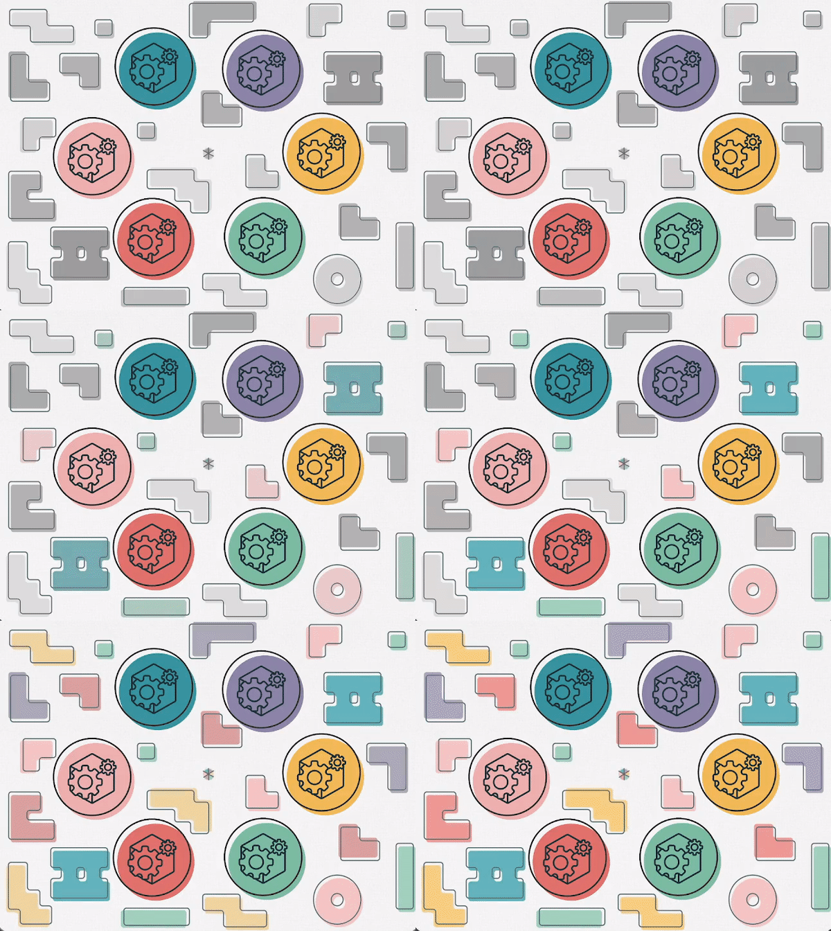
After creating the background test in Figure 2.2.3, instead of creating another static image to showcase the idea, I created a short gif showing the grey shapes gaining colour after each level is completed.

Figure 2.3.2 - A gif prototype of the website design.
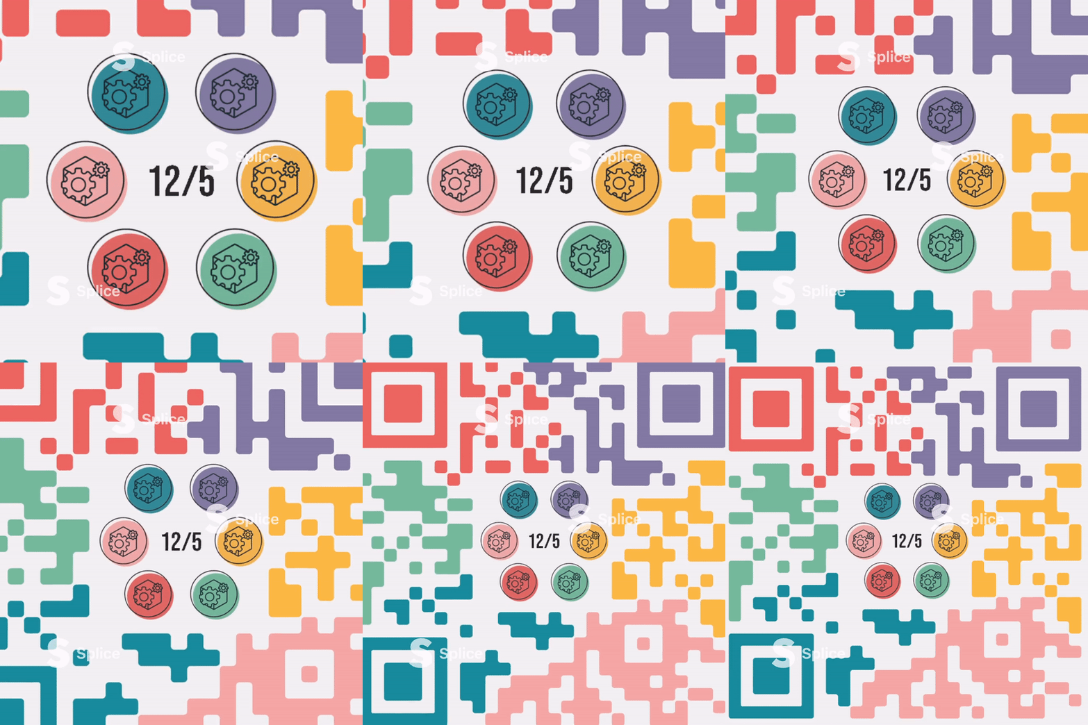
With the development of the QR code idea, I also created a prototype of the page "zooming out" to show the QR code.

Figure 2.3.3 - A prototype of "discovering the final level".
