Section 1 - Concept
Section 1.1 - Front Page Wireframes + Research
My first step was to design a handful of wireframes to focus on allocating the space available
as well as deciding which content would be displayed where. For my main page, I designed two
different wireframes to decide between, shown in figures 1.1.1 and 1.1.2.
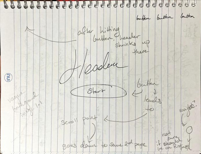
Figure 1.1.1 - A wireframe design for a front page
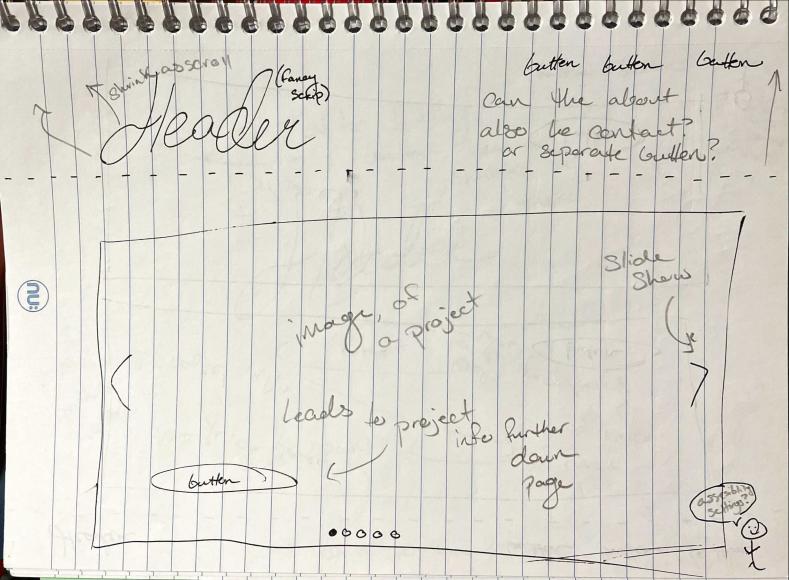
Figure 1.1.2 - A different design for a front page
My first design, 1.1.1, was based off previous websites I've designed that proved to be very
popular (see figures 1.1.3 and 1.1.4 for examples) and my second, 1.1.2, was designed based on
corporation websites we looked at in class that typically featured a carousel design.

Figure 1.1.3 - A template I created to give information about the owner and content of a blog as well as their "Do not interact" and "Before you follow" requirements
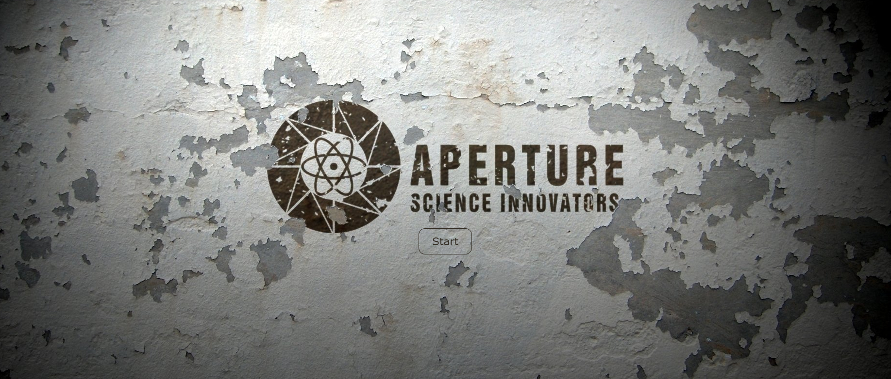
Figure 1.1.4 - Another template I created for the front page of a company or game's website, using a logo from the video game Portal.
Ultimately, I decided to go with my first, button design as while there was nothing in particular
wrong with the carousel design, it was also a very common choice for my peers and I wanted a design
that I felt stood out more. In addition, I felt that the carousel didn't work well with my idea for how
the rest of the page would be laid out, as I would've had to repeat the information for each project twice.
The button also makes it significantly more obvious that there is more information to scroll for, as
clicking it scrolls for you. It also gave a front page to display my logo and color scheme to allow
coherency throughout the web page. The idea was that when clicking the "start" or "enter", the page would
scroll down to show boxes with each of my projects within them , as well as a short description and a link
to the page discussing it further, as shown in figure 1.1.5.
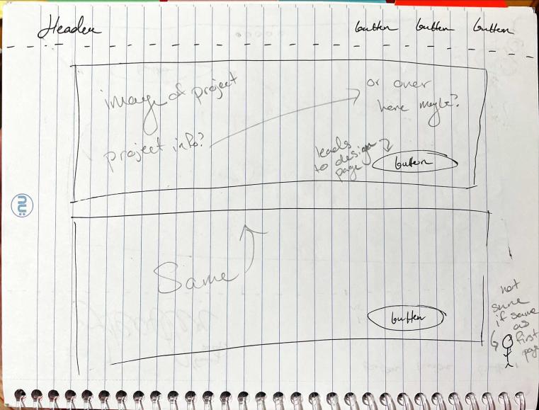
Figure 1.1.5 - The front page when scrolled down
Section 1.2 - Project + About Pages Wireframed
Next I worked on the wireframe for the about page. When designing this page, I stuck to the outline
used for my pre-existing resume in order to have consistency between the two designs. I knew I wanted
to have a place for an image of me, as well as somewhere to put any relevant information. For a while,
I was unsure if this was going to be the same page that had my contact info, and if so, where I would
put it on the page. For the initial wireframe, shown in figure 1.2.1, I included a separate button on
the header for a contact page, implying that it was a separate page in and of itself but I never created
nor thought to create a wireframe for this supposed contact page. Later on, when developing the about
page, I included my contact info here as well, something I was subconsciously intending but never actually
wrote down.
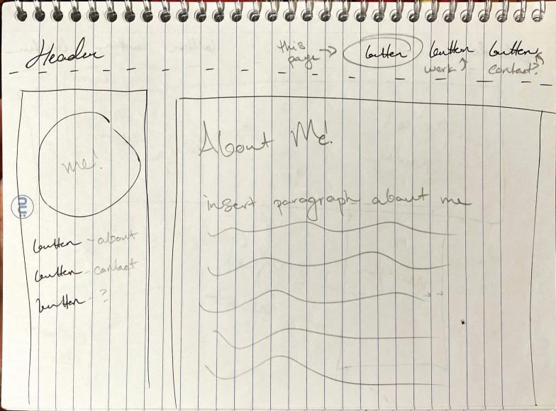
Figure 1.2.1 - The wireframe for the "About Me" page
After that, I focused on the various project pages. Each project's page would be identical just with
different images and content filled in so I needed to design a page that made it seem unique for each
project. I wanted the page to be asymmetric, allowing for a back-and-forth design between the title/description
and the project images themself. This wireframe is also the first one that had the inclusion of a dropdown menu
in the header, showing how it was intended to overlay any content on the page when brought up (See figure 1.2.2).
Further down on the page, I included a table of contents and then divided the rest of the project page up
into sections for easier navigation, as seen in figure 1.2.3.
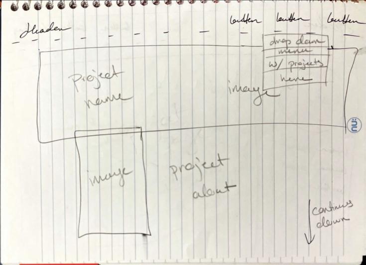
Figure 1.2.2 - The wireframe of the beginning of a project page
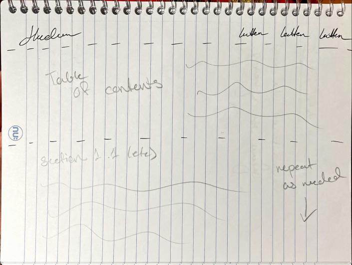
Figure 1.2.3 - The project page scrolled down
Section 2 - Creation
Section 2.1 - Designing my logo
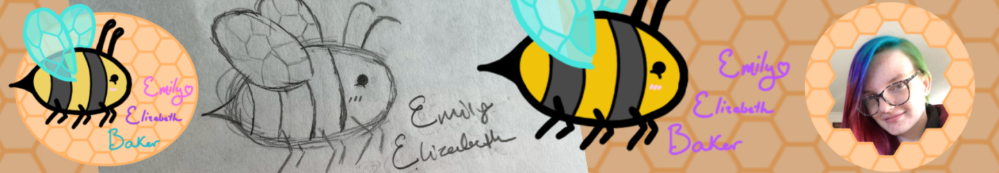
Right off the bat, I knew I wanted my logo to be a bee. I in no way consider myself to be an
artist and a cartoon bee was a very simple yet cute design that I felt I could achieve in a
way that I would be happy with it. In addition, my typical username on social media accounts
since 2012 have always included the word bee in one form or another, typically as a placeholder
for my last name. To top it all off, my initials backwards spell bee, which is also why I
included my full name in the final logo. Starting off, I sketched out how I wanted the bee to
look in my sketch book (see figure 2.1.1) and was thoroughly surprised by how well it turned out.
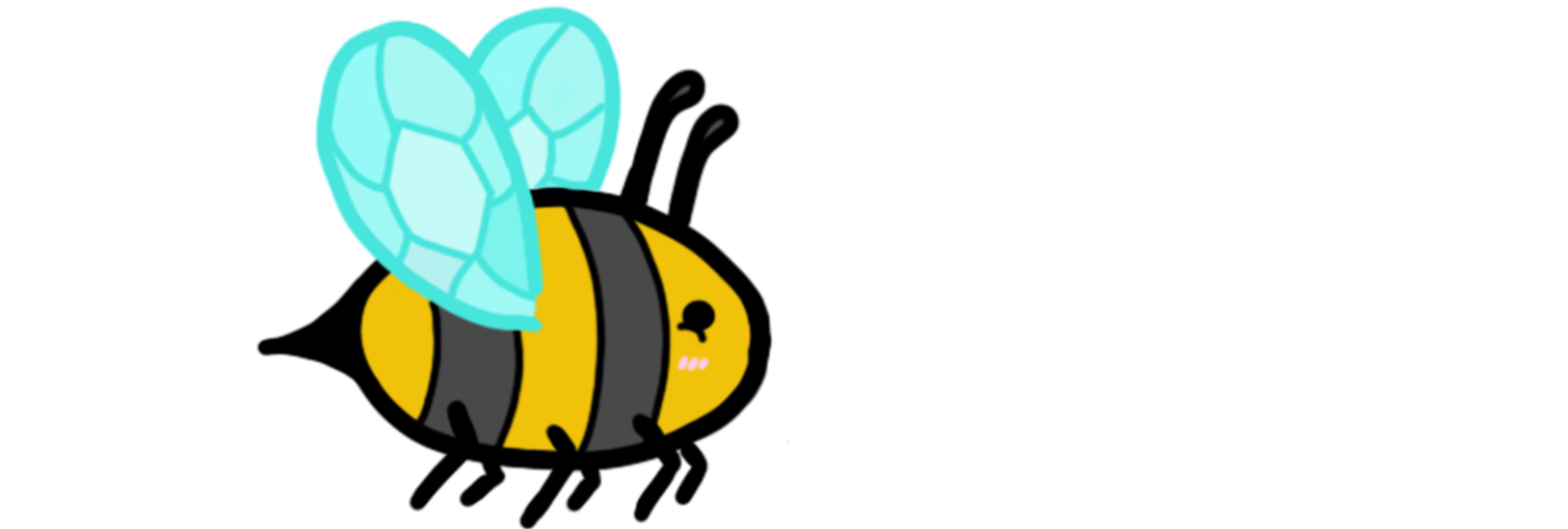
In order to make the bee seem more cartoon-y and cute, and at the suggestion of my friend Eden
Smithbury, I added 3 lines on it's cheek to represent blush as well as a semi-circle beneath the
eye to represent the eyes scrunching as if the bee was smiling.
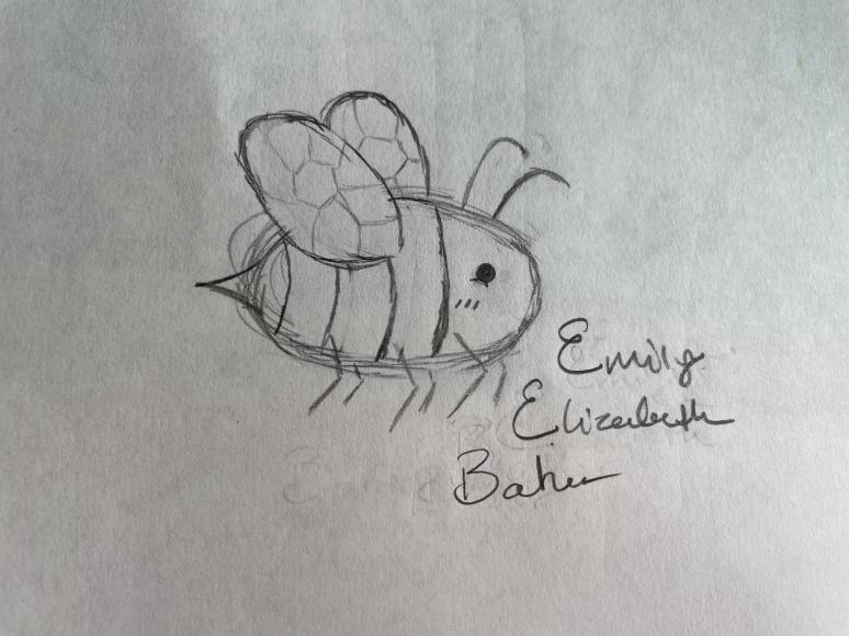
Figure 2.1.1 - An initial sketch of the bee icon
After that, Eden allowed me to borrow her laptop to draw the bee digitally in photoshop (as my
laptop refuses to run it and the art application I use on my phone is only good for editing).
First, I drew just the bee and colored it (figure 2.1.2), and then I added my name next to it.
The idea behind the diagonal was that while it would still be read in the correct order, if you
were observant, you would notice that the capital letters spell bee. (figure 2.1.3). After that,
Eden helped me pick out the colors for and line up the hexagons behind it, creating the honeycomb
design. In figure 2.1.4, the yellow of a bee is a slightly lighter color which was changed by the final
iteration (figure 2.1.3), as I felt it didn't stand out enough against the orange background.
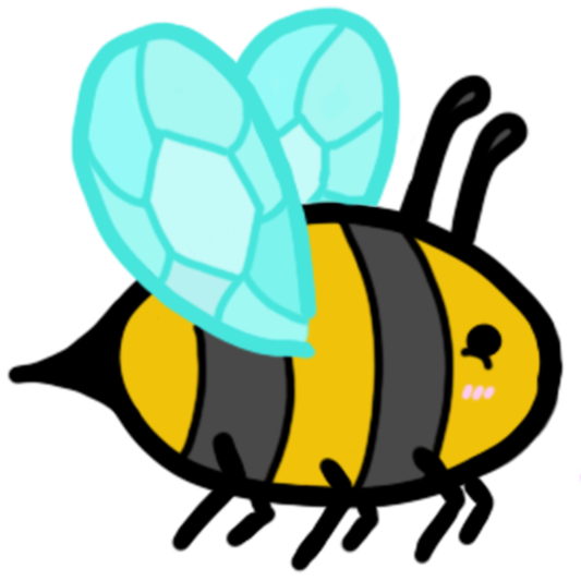
Figure 2.1.2 - The digital version of the bee
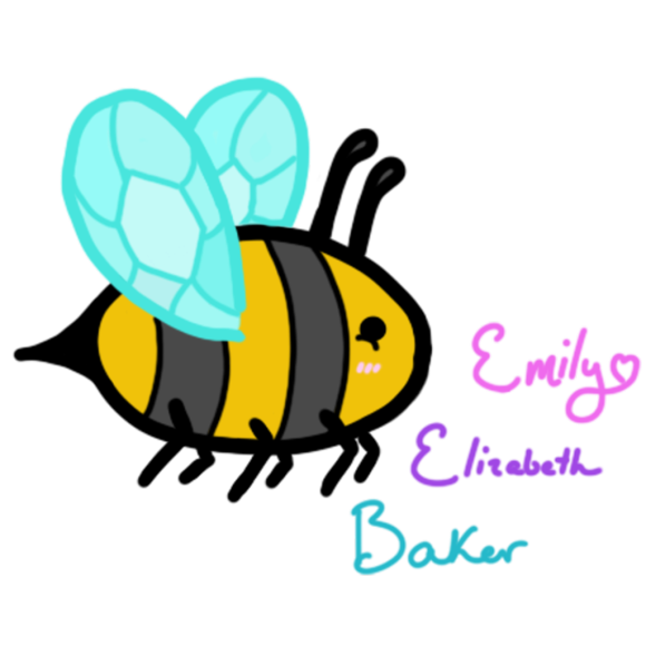
Figure 2.1.3 - The final iteration of the bee logo
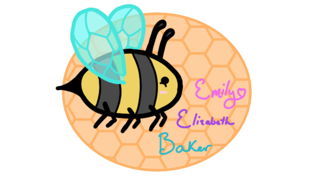
Figure 2.1.4 - The bee logo with added honeycomb and unfinished colors
Section 2.2 - Coding the Front Page
To start off, I knew I wanted the background image for the front page to be different from the
rest of the web page and the only way I could think to do that was to have the front page be a
header tag that spanned the entire page. Within my CSS stylesheet, I set the height and margins
of the header to 105% and -10px respectively to ensure that the background image took up the entire
screen, and centered the content within it. Originally I had text above the button but later replaced
it with my logo as I felt it fit the theme and look of the web page better. Then, when creating the
button, I discovered that buttons don't actually work within html header. Since this was the first
thing I was creating, I didn't know how to go about creating a button lookalike so I went to the
internet for help. I found someone else had posted onto a forum with a similar problem and a random
internet stranger provided them with code for a "custom button" using a hyperlink and CSS. After
implementing this code into mine, I started off with editing the CSS, to both understand what each
part did and to change it to how I wanted it to look. It took me a bit longer, after implementing
many more hyperlinks through my webpage for me to fully understand how the html worked for the custom
button but I did eventually.
Next up was the navigation bar. Originally, I made the navigation bar as a horizonal list, which seemed
to work for the time being. While doing this, I accidentally put justify-content: center and when I tested
the webpage next, I actually liked the look of that much better than the way I designed my navigation bar
in the wireframe. After that, I did research into how I could create a dropdown menu for the Works part
of the navigation bar and discovered that as a horizontal list, it would be extremely difficult and/or
completely impossible so I re-worked the navigation bar to be made up of divisions that I could stylize
appropriately. I kept the buttons in the center and moved the bee icon to the right side as I felt it
looked better over there. After that, I made the sections for the content below it out of a table, which
took a decent amount of fiddling as various parts weren't working out how I wanted them to. However, after
a lot of editing and asking for help on an online forum myself, I got it working as intended.
Section 2.3 - Coding the Project + About Pages
Next up was coding the about page. Since the code for the navigation bar already existed, I simply copied
that over and focused on the content of the page. My first step was to divide the page in two using a table
once again. Because I wanted the left side of the page to stay there when you scrolled, I created a class
aptly called sticky, which set the position as sticky at the height of 144px, which on my screen caused it
to be directly below the navigation bar. After that, I simply put the About Me and Contact sections into the
right hand column and ensured the buttons navigated to them properly.
For the project pages, I once again copied the navigation bar over and worked on the content from there. The
first thing I created was the header image that spanned the top of the page, and because I would have to repeat
the same code for multiple pages with different images, I decided to create a class that defined the height and
width instead of just putting into the image tag itself, which made it as simple as adding the image into the
division tag. After that, when I went to make the rest of the page, I realised that the overlapping image below
in my wireframe would be extremely difficult if not impossible to make (or at least I had no clue how to make it)
so I decided to scrap that idea entirely. Instead I did what I knew and created a table to divide the title and
description, and then continued that table down a row for the table of contents as well. After that, it was as
simple as breaking the content up into sections using headers and line breaks.